You have roughly eight seconds. That’s the window a visitor gives your campaign page before deciding to scroll on — or click away forever. In that chaos, a well-chosen laptop mockup can be the single design asset that separates a campaign that funds in 72 hours from one that quietly expires.
This isn’t hyperbole. It’s psychology. When a backer lands on your campaign, they’re not reading your product description first — they’re forming a gut feeling based on the quality and professionalism of your images. Mockups are how creators shape that gut feeling before a single word is read.
Why Mockups Matter More Than Screenshots
Screenshots communicate function. Mockups communicate lifestyle. A flat browser screenshot on a white background lacks context, atmosphere, and story. A well-crafted, photorealistic laptop mockup answers the question every backer is secretly asking: “Can I picture myself using this?”
“Backers don’t fund features. They fund futures. Your mockup is the first glimpse of that future.”
A professional mockup does three things at once: it establishes credibility, creates emotional context, and reduces perceived risk — making a backer feel safer pledging to something that looks finished.
The Anatomy of a Great Crowdfunding Visual Strategy
Successful campaigns open with a hero image — a front-facing laptop mockup showing the core product UI — then build the story through supporting visuals: feature close-ups, different screen states, contextual shots. Backers skim in an “F-pattern,” so front-load your strongest mockup at the very top.
- The hero mockup should show your core value proposition on screen — not a generic interface.
- Use different viewing angles to give depth to a digital product across the page.
- Maintain consistent color styling so your campaign feels like a brand, not a collage.
- Limit your mockup count — three to five strong scenes outperform a dozen mediocre ones. Quality of visual storytelling always beats quantity.
- Think in sequences, not single images. Each mockup should answer a different backer question: the hero establishes what it is, the second shows how it works, the third proves it fits into real life.
Real-World Examples: Laptop Mockups in Practice
Kickstarter — Browser Extension “FocusFlow” A solo developer used a single well-lit laptop mockup as their campaign header. Visitors understood the product instantly. The campaign reached 340% of its goal — the creator credited the mockup with a dramatic drop in bounce rate.
Indiegogo — Analytics Tool “Analytiq Pro” A two-person startup raised $60,000+ by building their campaign around five laptop mockups, each showing a different dashboard state. Warm-toned backgrounds made a data-heavy product feel approachable. Backers repeatedly cited “it just looks so clean” as their reason for pledging.
Indiegogo — Online Course Creator An EdTech founder used angled top-view mockups in a warm workspace setting — no expensive photography needed. The campaign raised $112,000. Post-campaign, the founder estimated mockups saved roughly $8,000 in photo shoot costs.
Kickstarter — AI Writing Tool A founder A/B tested raw screenshots against laptop mockups on their pre-launch page. The mockup version converted 2.7× better. The Kickstarter campaign funded in under four days.
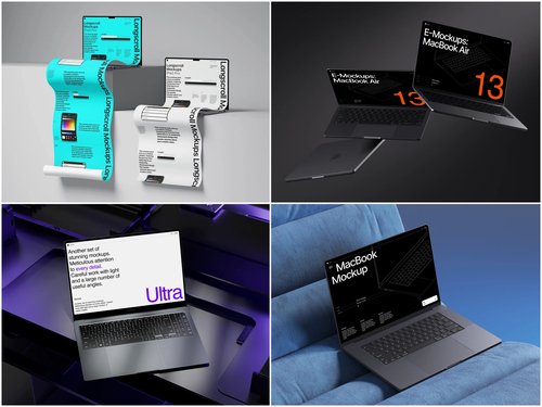
Laptop Mockups on ls.graphics
When quality matters, ls.graphics stands apart from generic free-stock alternatives. Their laptop mockup collection is built for professional use from the ground up:
- Ultra-realistic rendering — lighting, reflections, and shadows that hold up at every zoom level.
- Organized layers — clean, labeled PSD and Figma files so placing your UI takes minutes.
- Many angles — front-facing, angled, top-down, closed, open — enough to build a full visual story.
- Color styles — multiple variants per scene to match your product’s palette.
- Stylish minimalist compositions — editorial setups that let your UI breathe.
- Edit Online feature — drop your screenshot into a mockup directly in the browser, no software needed.
- Free scenes to try — test the quality before committing to a premium pack.
Choosing the Right Mockup Style
Match the emotional register of the scene to your product’s audience. For analytical tools — dashboards, dev tools, data apps — choose cool-toned, minimal setups that reinforce precision. For creative or lifestyle products, warm-light scenes with organic props suggest flow and inspiration. For B2B tools, neutral angled shots communicate seriousness without sterility.
The biggest mistake creators make is choosing the most beautiful mockup without asking whether it creates the right emotional context for their specific backer. A gorgeous mockup in the wrong register is still the wrong mockup.
Conclusion
Crowdfunding is a trust exercise. Backers fund something that doesn’t fully exist yet — and your visuals are the primary trust signal. Every sharp, considered mockup builds that trust. Every generic screenshot erodes it.
The creators who consistently outperform on Kickstarter and Indiegogo treat their campaign as a designed experience. Start with the right tools — ls.graphics offers a library where quality is the baseline, not the exception.